Showing posts with label Interior. Show all posts

Monday, 2 November 2015

Daring Green...


After two years of living in our wonderful apartment I've recently decided that I'm finally ready to move on to phase two of the renovation, or rather interior redecoration to be more precise, as we won't be knocking any walls down. Phase one comprised of the necessary tasks one must undertake when buying an already lived in home, a fresh coat of clean wall paint, a retile of what was a once flooded laundry yet never well cleaned, and the replacement of a couple of decayed floor boards. So nothing overtly exciting. 

Now, I'm hoping this next phase will be more exciting, it 's less a 'fix it' phase and more of a design phase. But I'm at a cross roads. It being your own home, and you being the person who can implement any visual idea that you want, it actually makes it hard to know where to begin. Do I put colour on the wall or wallpaper, or what about a mirror to reflect the amazing view? And do I gather beautifully aged recycled wooden furniture or do I invest in ruggedly grungy copper accessories? All these things appeal to me, and maybe all can even work together if well mixed. But I want to be sure to avoid making our humble ninety square metre apartment look like Willy Wonka's chocolate factory...

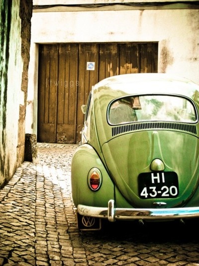
So here I am, I guess more in a planning phase rather than designing for now. This week I've been exploring the idea of adding some green into the interior. It'd be a colour I've never thought to use before, but I think it could work well if done right and in the right measure. I definitely feel a little out of my comfort zone with green, but these images show just how incredibly well it can be incorporated if one can exercise self control...


Images - all via my pinterest

Friday, 21 August 2015

Vila Leopoldina Loft, by Diego Revollo

Vila Lepoldina Loft by Diego Revollo - Nest of Pearls

The above image stopped me in my tracks when I came across it. There was something so original in the canvas that hangs on the wall. The subject's eyes are so piercingly beautiful yet gentle, and the softness of her fringe so girl-like. I also wonder what she's listening to on her big head-phones... Beyond the uniqueness of the canvas itself, the photograph of the interior also has a great composition. The framed image plays with symmetry and gradient at the same time. The symmetry comes from the canvas' reflection in the coffee table, and the gradient of colour comes from the downward journey from the light creamy textured walls, to the grey minimalist sofa, through to the dark purple rug. It takes a special eye to make so many visual elements work in a space so seamlessly.

Vila Lepoldina Loft by Diego Revollo - Nest of Pearls

And the space in question is Vila Leopoldina Loft, by Brazilian architect and interior designer Diego Revollo. The 70 square-metre home was specially designed for the owner, who is an actor, with theatrical accents such as curtains playing a key role in the space. With limited use of doors, the curtains are used to divide the spaces where needed.

Vila Lepoldina Loft by Diego Revollo - Nest of Pearls

There is so much care and attention to detail that lives within the design of this home, and I'll leave you to enjoy the photos by yourself. But there's one thing that I found witty and quite playful in terms of visual repetition that I wanted to mention, and that is the reference to the swirl. In the living room area Leopoldina has used the Wiggle Side Chair by Frank Ghery, and then in the bedroom above the bed, hangs an image that looks into the spirally insides of a building. In an interior mostly dominated by straight lines and sharp edges, I love this subtle relationship between two soft and swirly elements, which complement each other... 

Vila Lepoldina Loft by Diego Revollo - Nest of Pearls

Vila Lepoldina Loft by Diego Revollo - Nest of Pearls

Vila Lepoldina Loft by Diego Revollo - Nest of Pearls

Vila Lepoldina Loft by Diego Revollo - Nest of Pearls

Vila Lepoldina Loft by Diego Revollo - Nest of Pearls

Vila Lepoldina Loft by Diego Revollo - Nest of Pearls

Vila Lepoldina Loft by Diego Revollo - Nest of Pearls

Vila Lepoldina Loft by Diego Revollo - Nest of Pearls

Vila Lepoldina Loft by Diego Revollo - Nest of Pearls

Vila Lepoldina Loft by Diego Revollo - Nest of Pearls

Vila Lepoldina Loft by Diego Revollo - Nest of Pearls

Vila Lepoldina Loft by Diego Revollo - Nest of Pearls

Vila Lepoldina Loft by Diego Revollo - Nest of Pearls

Source - design-milk.com
Images - design-milk.com

Related Nest of Pearls post - Paris apartment dreaming, with Paola Navone 


Friday, 24 July 2015

Teeny yet super functional city pad of designer Szymon Hanczar

Small apartment design by Szymon Hanczar - Nest of Pearls

This teeny weeny 13 square metre apartment belongs to Polish designer Szymon Hanczar. While it's not his primary abode, as a lecturer at Wroclaw Academy of Fine Arts & Design he does need to spend a fair bit of time in the city. Not wanting or needing anything that was too big, Hanczar did however want to make sure that it was homey. As a result, he is extremely happy with the outcome because while the apartment is comfortable despite its small size, it also ticks two other key criteria for him, having sufficient storage and being hotel-like, a place he can stay at when in Wroclaw.

Small apartment design by Szymon Hanczar - Nest of Pearls

Apart from the WOW factor of seeing how people design so smartly for small spaces, this type of design is extremely relevant for how many people need to, or simply choose to live today. Across the globe, in all the wonderful big, busy, bustling cities of the world, people care less and less for space, and more so for location. They want to be in the thick of it all, amongst the buzzing, ever-evolving life in the city streets. They want to step outside their little pad and have quick access to funky cafés, relaxing parks, great museums, and so forth. They have little interest in being cooped up indoors, needing to maintain and clean large homes.

Small apartment design by Szymon Hanczar - Nest of Pearls

And living small does not mean living dingy or poorly. Hanczar's 13 square metre humble haven is proof of how a small space can be well designed and inviting. He has accommodated for all that is absolutely necessary for him. There is a toilet and small kitchen under the raised bed. There is even room for his bike which adds a modern touch of design against the white wall where it hangs. The furniture and joinery are minimal and above all very functional. The apartment has been kept very light in terms of the colour and texture of the materials used, so that it maximises light reflection and embodies an air of openness.

Small apartment design by Szymon Hanczar - Nest of Pearls

Small apartment design by Szymon Hanczar - Nest of Pearls

Small apartment design by Szymon Hanczar - Nest of Pearls

Small apartment design by Szymon Hanczar - Nest of Pearls

Small apartment design by Szymon Hanczar - Nest of Pearls

Small apartment design by Szymon Hanczar - Nest of Pearls

Images - dezeen.com
Photography - Jedrzej Stelmaszek

Related Nest of Pearls post - Could this be the smallest house in the world?


Tuesday, 14 July 2015

Attic redesign in an 1880's duplex, by L. McComber Architects

Attic redesign by L. McComber - Nest of Pearls

This cute attic redesign was a 2013 project undertaken by architecture firm L. McComber, based in Montréal, Canada. The project in question, also located in Plateau Mont-Royal, Montréal, existed under what was a 1.5 metre high structure of two sloping roofs. This structure was made with thick layers of tar and gravel, and was part of an old duplex built in 1880.

Attic redesign by L. McComber - Nest of Pearls

Replacing this thick, heavy structure with an open-truss roof, gave the space a considerable amount of extra room, lifting the overall ceiling height to an impressive 4 metres. The space, acting as both bedroom and work space, is organised around a series of shelves made of recycled wood. These shelves weave around the space creating a strong visual element amongst what is predominantly a pristinely white interior.

Attic redesign by L. McComber - Nest of Pearls

The space is simply magical, it's like an escape for a modern-day princess (or prince). Every line has been given consideration and visually lines up with something else of relevance within the space. This is such a simple but important formula when designing, especially for little spaces. Add too many ingredients that don't line up and you're telling too many individual stories in the same breath. But line them up, as it has been done here, and you create harmony for the eye, harmony for the aesthetic perception that lives in all of us, which instinctively calculates when we're confronted with good design.

Attic redesign by L. McComber - Nest of Pearls

To add to its charm, the attic is immaculately organsied. Books and picture frames give the space character, so one doesn't feel austerity in an overwhelmingly white space. Adding to this warmth of character is the parquet. The wood underfoot, along with soft lighting, give the attic both a modern yet homey feel.

Attic redesign by L. McComber - Nest of Pearls

Attic redesign by L. McComber - Nest of Pearls

Attic redesign by L. McComber - Nest of Pearls

Attic redesign by L. McComber - Nest of Pearls

Attic redesign by L. McComber - Nest of Pearls

Attic redesign by L. McComber - Nest of Pearls

Attic redesign by L. McComber - Nest of Pearls

Source - lmccomber
Images - lmccomber
Photography - steve montpetit

Related Nest of Pearls post - 29 perfect little square metres